Whether you’re new to trading in traditional or cryptocurrency markets, it is important to understand the tools available to investors and speculators to the best opportunity to make a profit. One of the most essential tools in your arsenal is charts. We’re going to give you a quick overview of the four popular charts: Line, Bar, Candlestick, and Heikin Ashi charts.
Line Charts
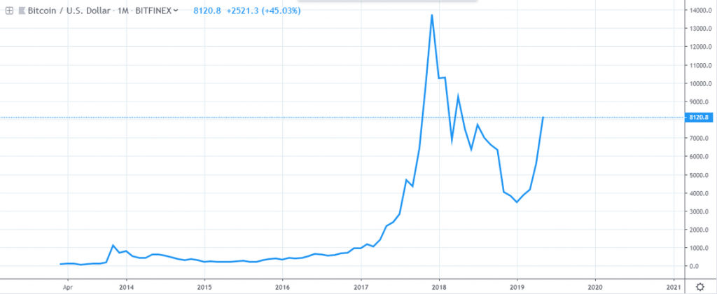
A simple line chart connects plot points against stated scales on the horizontal and vertical axes. When the points are then connected, the line that’s drawn indicates the changes which have occurred over x period of time.
In any chart analysis, line charts are beneficial for seeing broad trends, but it is important to understand what is being represented within the chart. Sometimes you will see more than one line, each line representing a different factor which may run parallel or crisscross each other within the chart.
Each point has a stable X,Y value which can be interpreted as true, but one thing to be aware of when reading line charts is that several lines on one chart does not necessarily mean one track mirrors another. Remember that the horizontal and vertical information is true. The points of data are the variables which move with the market thus creating the line patterns once the dots are connected.
Below is an example of a line chart for the monthly time frame of BTCUSD.
[rml_read_more]
Bar Charts
Bar charts, often referred to as “OHLC”, tells more of a story that is occurring around the cryptocurrency price using four key variables. These variables include Open price, High price, Low price, and the Closing price.
The monthly chart of the BTCUSD is plotted using bar charts:
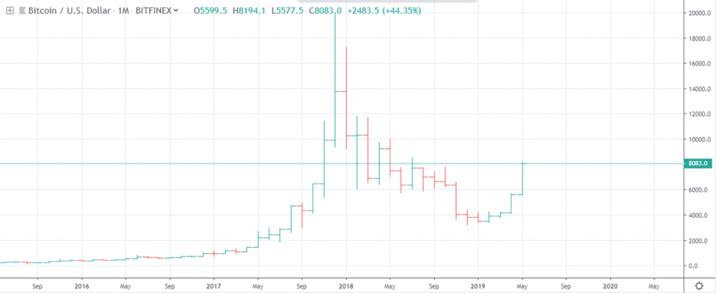
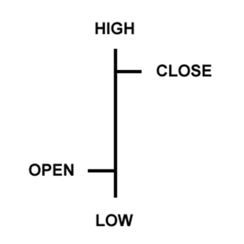
Open Price: This is represented by a small horizontal line on the left-hand side of the bar.
High Price: The top of the vertical line illustrates the highest price of the time interval
Low Price: The bottom of the vertical line denotes the lowest price of the time interval
Close Price: This is represented by a small horizontal line on the right-hand side of the bar.
In summary, open price is represented by a horizontal hash at the left-hand side of the bar, while the close is depicted with a horizontal hash at the right side of the bar, and the high price is represented by the top of the bar, while the base of the bar shows the low price.
To better understand bar charts in layman’s terms, let’s use an apple for an example. On a one day chart, the price of an apple opens at $3 per apple at the beginning of the day. As the day progresses, an apple sold for as low as $2.00 but later rallied to $4.50 to finally close end of day at $4.
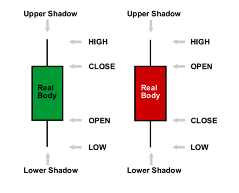
Candlesticks Charts
Candlestick charts present similar price data as the bar chart with notable differences in the display. Like bar charts, candlesticks represent the high-low range within a given time interval, and the candle body is a symbol of the open to close range.
Typical candles display a hollow/transparent candle body as a bullish closing candle when the closing price is greater than the low.
On the other hand, a filled in candle body indicates a bearish closing candle; the price closed lower than its open price.
As the day progresses, white-bodied candles are replaced with green color, while black-bodied candles fill in with red. This enables us to easily identify the up and down trends with an summary-type overview of the market history.
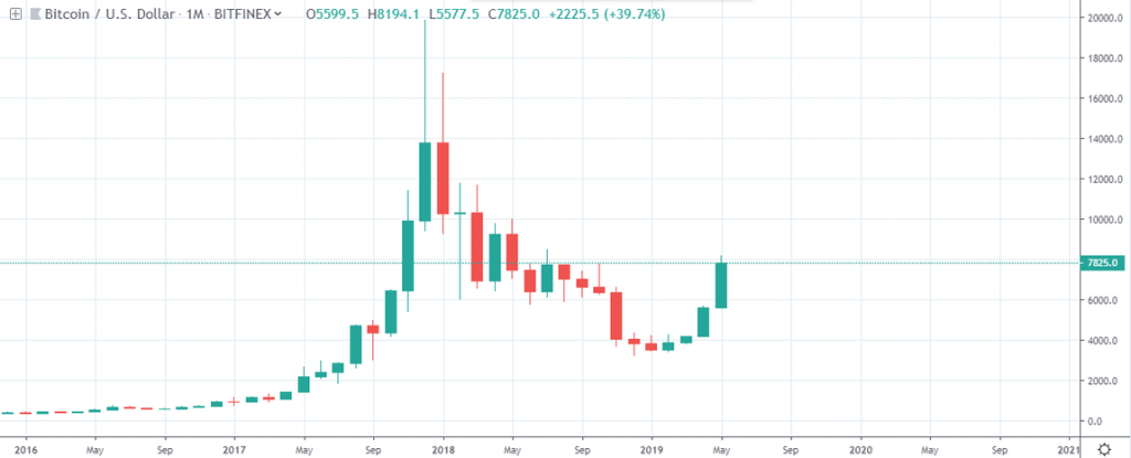
The BTCUSD chart below shows bullish and bearish closing candlesticks.
Advantages of candlestick charting:
- Candlesticks are easier to interpret and visualize when compared to bar charts.
- Japanese Candlestick patterns have easy to remember names such as “Pin-Bars,” which are beneficial to watching reversals or indecisive sentiment in the market.
- Candlesticks are useful for identifying crypto trend continuation, and reversals which we will touch upon in future articles.
Heikin Ashi Chart
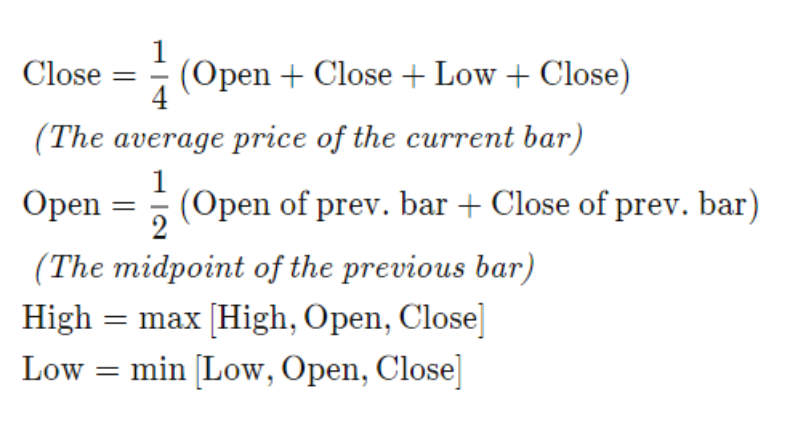
Heiken Ashi, often referred to as a better candlestick chart, means “average bar” in Japanese. This alternative representation of price makes identifying trends and future price projections a little easier.
Below is the formula for calculating the Heiken-Ashi candles.
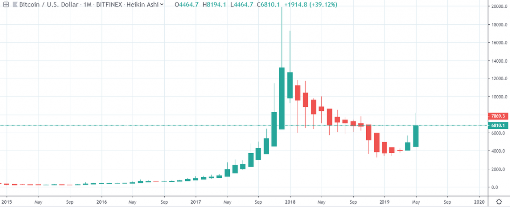
Compared to candlestick charts, the Heiken-Ashi charts are smoother as they follow the general outlook of a market.
Considering that the Heiken-Ashi takes an average of the price, the closing price of a cryptocurrency may not align with that of the Heiken-Ashi close.
Below is a monthly BTCUSD bar display of the Heiken-Ashi, notice how smooth the chart is.
The Heiken-Ashi chart really deserves more in-depth evaluation than a quick summary, in part because there are more factors to the chart which is beneficial to investors, and justifies a better examination that the space we are providing in this article.
When it comes to reading, evaluating, and truly understanding market trends, knowing the different types of charts is critical to making smart, informed decisions before you invest. Of course, choosing a favorite chart is subjective to each person, but knowing exactly what you’re looking at is a great first step.
Disclaimer
Content provided by CryptoTraderNews is for informational purposes only, and should not be construed as legal, tax, investment, financial, or other advice. All information is of a general nature. As always, there is risk with any investment. In exchange for using our products and services, you agree not to hold CryptoTraderNews Pro, its affiliates, or any third party service provider liable for any possible claim for damages arising from decisions you make based on information made available to you through our services.