
Timing is everything, and when it comes to crypto trading, this is never more true. Whether you’re a seasoned or rookie crypto trader, understanding multiple time frame analysis; knowing what to look for and when to jump in, is critical to earning a profit on your investments.
If you’ve been navigating through your favorite exchange, you will have noticed there are time series charts which can be viewed in monthly, weekly, daily, 4-hour, 2-hour, and 1-hour intervals. Let’s review what multiple time frame analysis can do for you.
Trading style is as diverse as the trader and many carry different sentiments on how to analyze the trending direction of cryptocurrency prices. Honestly, there is no wrong way to do it – but there is a wrong time to jump in. Determining that with pinpoint accuracy is impossible but we all do our best with tools and knowledge at our fingertips.
Let’s use Jack and James as our example traders. Jack views the charts from the daily time frame and sees that BTCUSD is in a bullish trend. James, on the other hand, notices that it is oscillating within a bearish channel on the 4-hour time frame. Both Jack and James are correct because their choice time frame gives them a contrived view.
[rml_read_more]
Why does Jack see a bullish trend and James thinks it will descend into a bearish pattern? Because the analysis of the independent time frames might not be aligned with one another.
When’s a good time to trade?
The majority of new crypto traders often do not have great results in trading for a multitude of reasons which include inexperience, impatience, and more likely they are reading the charts wrong and jumping on the wrong side of a trend.
Think of trading like trying to shoot a moving target. The trend is always moving along on the timeline with hips and valleys within any given time frame. For beginners, we recommend viewing the monthly chart and whittling down to the daily chart before moving to the shorter time frames like the 4-hour or 1-hour charts. This is help train you to see trends with a broader view.
Remember, success in trading requires patience and accurate timing to jump on the beginning of a trend, often indicated by consecutive bullish or bearish bars.
Modeling multiple time frames for crypto analysis
In this model, we are gathering all that we have learned about analysis and market predictions from using candlesticks, to Heiken-Ashi candles, to the MACD oscillator. This is going to be a top-down analysis of the BTCUSD cryptocurrency pair.
Here, we attempt to find correlation among three time frames in sequence with the highest being consecutive bullish or bearish closing candles within the pair. First is the monthly time frame which shows a broad view of what’s happening within this time frame. The second time frame looks at the bars from a Heiken-Ashi candlestick view, and the third time frame is from a MACD oscillator.
Monthly Time Frame
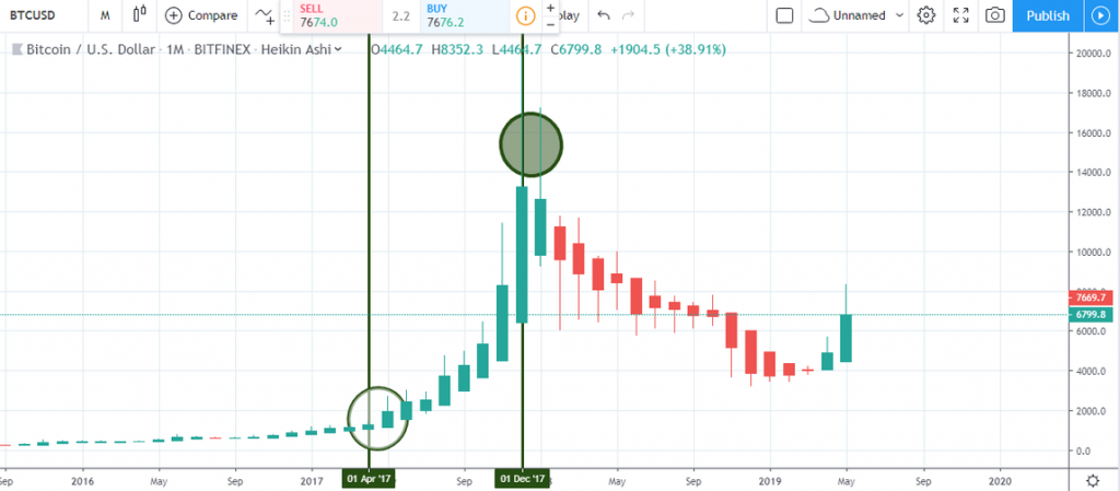
Notice how the BTCUSD enters a series of bullish closing candles on the monthly chart from April 03 ’17 to December 18 ’17. The double bullish accumulation setup on July 01 ’17 confirms a continuation of the series of bullish closing candles.
Weekly Time Frame
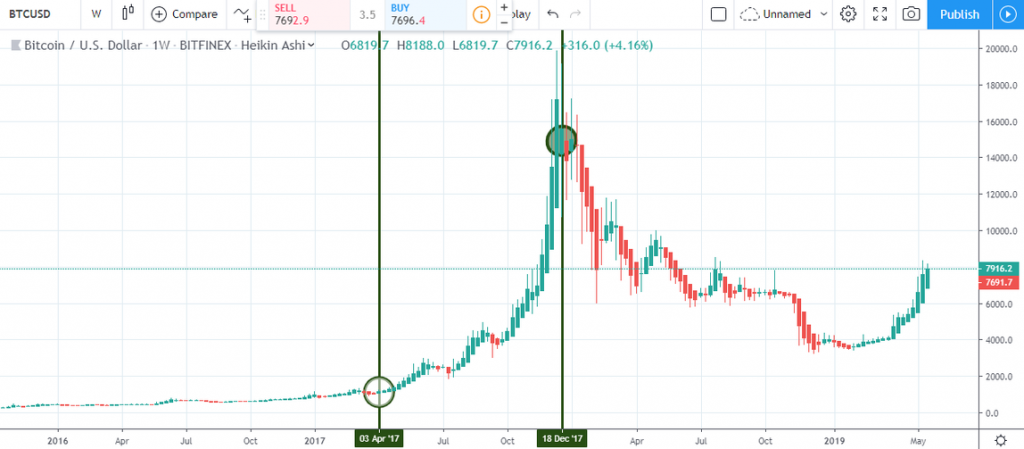
Still referring the BTCUSD within the date time range from April 03 ’17 to December 18 ’17, you’ll notice that the bearish candles within the time window do not follow each other in sequence. This is an indication that the buying pressure is on the increase.
Daily Time Frame
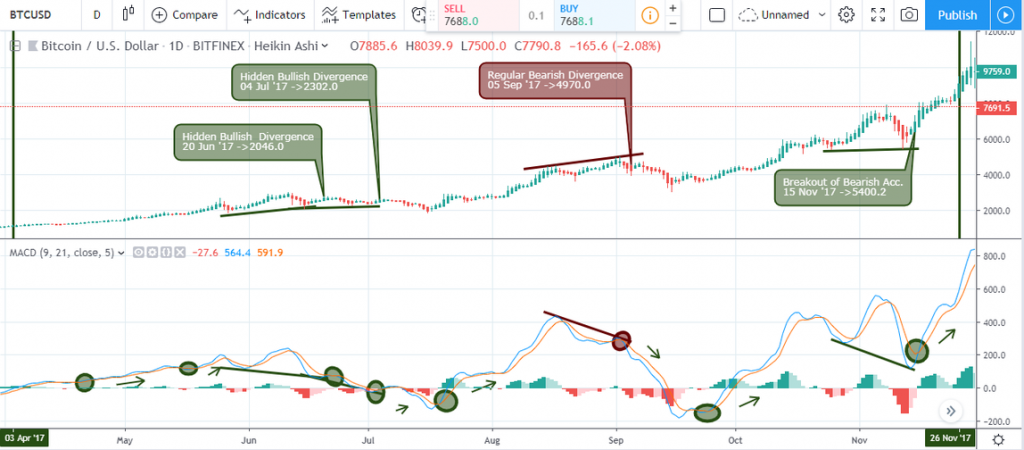
Let’s examine the daily time frame in our model because it’s time to pay close attention to the cycles of the MACD oscillator and recognize divergence patterns as high probability entry setups in the direction of the trend.
If you’re somewhat new to trading, we recommend starting your search for consecutive bars on the monthly time frame though it is perfectly find to begin your search from the lower daily and 4-hour time frame. This is because financial time series charts generally follow what is known as fractal geometry – there is self-similarity, if you will.
You can deploy the same method of searching for consecutive bars by looking out for preferably double bullish/bearish accumulation candle patterns on any time frame of your choice. This hints at the increase in demand or supply while the subsequent time frame hints on a continuation of the trend.
At this point in time, we do not recommend going lower than the 4-hour time frame in your search for consecutive bullish or bearish bars because market movement in the lower time frames often contain a lot of noise, whipsaw and whiplashes, which may lead to poor choices and erratic trade behavior.
Bringing it all together
From our experience, trading a cluster of the price and chart patterns such as a breakout of buying or selling pressure (accumulation), regular or hidden divergence, and harmonic patterns, lead to greater success when determining trend direction of crypto pairs. As you gain more insight into market movement, you will also see that patience is more than a virtue, it’s necessary to keep a healthy portfolio and for making smart choices from a broad spectrum view.
Disclaimer
Content provided by CryptoTraderNews is for informational purposes only, and should not be construed as legal, tax, investment, financial, or other advice. All information is of a general nature. As always, there is risk with any investment. In exchange for using our products and services, you agree not to hold CryptoTraderNews Pro, its affiliates, or any third party service provider liable for any possible claim for damages arising from decisions you make based on information made available to you through our services.